
Google has redesigned the logo for its Android mobile operating system.
A statement released by the corporation’s press service said that the green android robot will remain as the main distinguishing mark of the OS logo, but now only its head will be visible in the picture.
You can see a new font, new color and new logo with the head of Android’s official character right below:
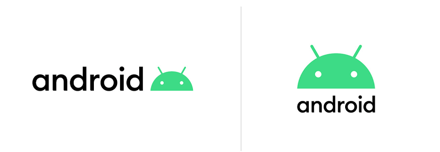
The corporate font and its color scheme were also changed and it looks more amazing.
In addition, Google has changed the principle of naming versions of the Android operating system’s next updates.
Now, new versions of Android will carry only digital signs instead of combining them with names of desserts and sweets.
“There were many options for sweets starting on Q, but we decided that the tenth version with 2.5 billion active users was an occasion to make changes,” the company emphasized.

In a blog post, Google shared that “we’ve heard feedback over the years that the names weren’t always understood by everyone in the global community.”
So, what do you think about this Android Q update?